
Trust & safety
Brand kit
On this page
Everything you need to write about  or show its logo: the name, the mark, the colors and the type. The look is called Midnight Lounge: midnight ink, champagne-gold foil, an editorial serif for big moments and crisp mono figures everywhere else.
The name
- Always : one word with a capital T, in prose, titles and the wordmark. Don't write the brand in all capitals or all lowercase. Lowercase belongs only in URLs and code, as in playtilt.gg.
- The tagline is Play it. Prove it.
- 's own games are Originals. A round is a round, money is your balance, and you stake, cash out, roll and pick.
- Wordplay is fine with a wink (" the table.", "Lean in."), but never as encouragement to chase losses. Don't write "go on tilt", "tilt harder" or "win it back". When the subject is responsible play, the voice stays calm and literal.
Writing about
- Crypto-native and direct. Speak like a trader talks to a trader. No hand-holding and no hype.
- Short, declarative, present tense. Two to eight words per headline sentence.
- You, not we. Address the player as you. speaks as or not at all.
- Numbers are exact or absent. Write figures such as
1.96×or98% nominal RTP before rounding. Never "huge wins", "best odds" or invented stats. - Casing. Headlines, buttons and game titles in sentence or title case. Uppercase only for mono labels and eyebrows.
- No emoji. The glyphs you can use:
×for multipliers,▸for enter or next,●for live,+and−on changes,✓on verified. - Honest urgency only. Countdowns are real round timers, and feeds distinguish actual settled rounds from explicitly labelled simulated activity.
- Stay clear of regulated vocabulary. Use 's own words for rounds, stakes and balances.
Logo
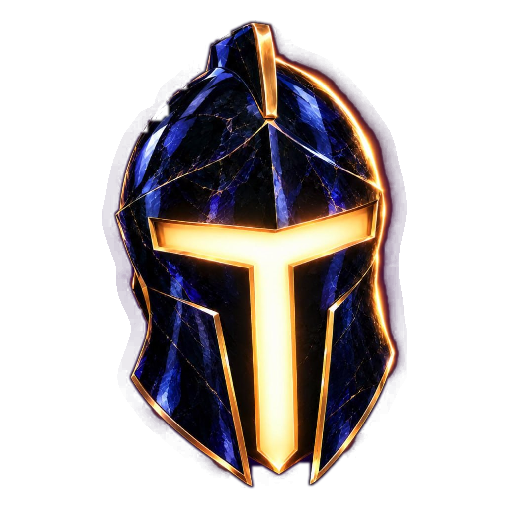
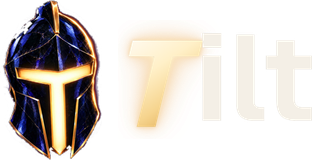
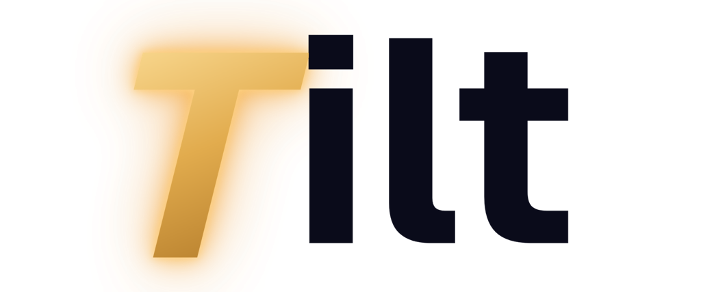
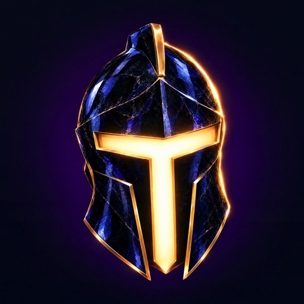
The mark is the helmet: dark crystal with thin gold edges and a glowing gold T for a visor. The wordmark is the word with a slanted gold T. The logo is the helmet next to the wordmark.
| File | Use it for |
|---|---|
| tilt-T-transparent-1024.png | The mark on its own, transparent, for dark backgrounds. Web sizes: 64, 128, 256 px (PNG and WebP). |
| tilt-wordmark-transparent-1024.png | The wordmark for dark backgrounds: the gold T with "ilt" in ivory. Web sizes: 80 and 160 px tall. |
| tilt-wordmark-on-light-transparent-1024.png | The wordmark for light backgrounds: the gold T with "ilt" in midnight. Web sizes: 80 and 160 px tall. |
| tilt-T-navy-1024.png | The mark on a midnight square: app icon, avatar and social profile picture. Also as 512, 192, 32 px and the Apple touch icon. |





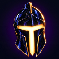

- Where each goes. The wordmark is the logo in every top bar and footer. The mark alone is for small square spaces: favicon, app icon, avatar, and stamped on chips, cards and the roulette hub.
- Sizes. The wordmark is 34px tall in a top bar (30px on phones) and 40px in a footer. Don't set it smaller than 24px tall, or the mark smaller than 24px.
- Clear space. Keep at least the height of the T's top bar empty on every side. The glow is part of the mark: don't crop it.
- Backgrounds. Use the dark versions on midnight and navy, and the on-light wordmark on ivory and white. On photos, only place the mark where the area behind it is dark and calm.
- Drawn in code. Where the T is painted onto 3D objects, it's drawn from the same shape (
drawTinhome/js/three/textures.js), in foil gold on navy or in midnight on gold.
Color
Night is the only theme. The palette is a midnight ground, one metal and three jewels, and each has one job. The full set is published as CSS custom properties in tokens.css.
Grounds and text
| Token | Hex | Job |
|---|---|---|
stage | #06070f | The darkest ground, for things that move: game stages |
bg | #0a0b1a | Page background, midnight ink |
bg-glow | #1a1030 | The plum radial glow at the top of every page; atmosphere only |
panel | #11122a | Cards and panels, with panel-raised, as a top-to-bottom gradient |
panel-raised | #171937 | Cards and panels, top of the gradient |
panel-hover | #1f2146 | Hovered rows and list items, active tab fill |
input | #0d0e22 | Input fields, icon buttons, the well behind bet amounts |
line | #25284a | Every 1px border and divider |
line-strong | #34386a | Hovered neutral borders; decorative, never the only edge of a control |
text | #f4efe6 | Primary text, warm ivory |
muted | #bdbcd6 | Secondary text |
subtle | #a8a7c6 | Labels |
dim | #5c5c80 | Decoration only, never text |
Metal and jewels
| Token | Hex | Job |
|---|---|---|
gold | #e8c47a | Money: balances, payouts, the mark, the leaning T and the one primary button per view |
gold-bright | #f6dca0 | Top stop of the foil gradient |
gold-deep | #b8893a | Bottom stop of the foil gradient |
gold-hover | #d4ad62 | Hovered or pressed flat gold |
on-gold | #231804 | Text and icons on gold and foil |
teal | #43d1b8 | Jade, for action and information: links, focus rings, the fairness seal |
teal-deep | #2aa893 | Pressed teal |
on-teal | #04211c | Text and icons on teal and green |
green | #4ade80 | Win only, always with a word or a + sign |
red | #ff5470 | Ruby, for loss and danger, always with a word or a − sign |
- Large gold is always foil:
linear-gradient(135deg, #f6dca0 0%, #e8c47a 45%, #b8893a 100%). - Green and red differ by hue, so always pair them with a word or a sign.
- Game accents: Crash Tower is gold, Dice is teal and Blackout is red.
- Never use blue-to-purple gradients, plum as a fill, flat yellow, gold text on teal, or white backgrounds.
Type
- Fraunces (display) is the sophistication: the hero, section openers and page titles, never smaller than 32px, at weight 560 to 650 with tight negative tracking. Italic Fraunces in foil gold is the signature accent.
- Geist (sans) is the product: navigation, buttons, card titles, body copy and tables. The wordmark is artwork: use the logo files, not typed text.
- Geist Mono (mono) is the money: every number, label, hash and chip, always with tabular figures. Figures in tables are right-aligned.
All three are open-source fonts under the SIL Open Font License 1.1. On Google Fonts, the families and weights are:
Fraunces:ital,opsz,wght@0,9..144,500..700;1,9..144,500..700
Geist:wght@400;500;600;700
Geist+Mono:wght@400;500;600
Type scale
| Style | Font | Size / line height | Weight | Tracking |
|---|---|---|---|---|
display-hero | Fraunces | 92px / 0.95 | 560 | −2.5px |
display-1 | Fraunces | 60px / 1.0 | 560 | −1.5px |
display-2 | Fraunces | 36px / 1.08 | 600 | −0.8px |
title | Geist | 18px / 24px | 600 | −0.2px |
lead | Geist | 19px / 30px | 400 | — |
body | Geist | 16px / 26px | 400 | — |
body-sm | Geist | 14px / 22px | 400 | — |
button | Geist | 15px / 20px | 600 | −0.1px |
multiplier | Geist Mono | 96px / 1 | 600 | −2px |
stat | Geist Mono | 40px / 1.05 | 500 | −1px |
balance | Geist Mono | 16px / 20px | 500 | — |
figure | Geist Mono | 14px / 20px | 500 | — |
label | Geist Mono | 11px / 14px | 500 | 1.6px |
chip | Geist Mono | 12px / 16px | 500 | — |
code | Geist Mono | 12px / 18px | 400 | — |
A dash means the style sets no tracking of its own.
Accessibility
- Text meets a 4.5:1 contrast ratio on its ground.
- The focus ring is 2px solid teal with a 3px offset.
- Wins and losses always carry words and signs, never color alone.